Coffee Spider Graphs Explained
When it comes to coffee (or any other food product, for that matter), spider graphs—AKA spider charts or radar charts or star charts—are incredibly useful for documenting sensory attributes and their intensity for both flavor and aroma. These charts can be a useful tool to visually compare and contrast samples or as a point of reference to benchmark for product development or specification creation.—i.e. “I want my coffee to taste like THIS.”
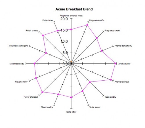
Spider charts are most commonly used for Descriptive Analysis projects as used in the examples below:
What Is A Spider Graph?
In essence, a spider graph displays a series of attributes on a predefined scale to create a visual representation of how a product tastes.
How are Spider Graphs Created for Descriptive Analysis?
The key to spider graphs is in blind testing by a trained panel. At Coffee Analysts, a team of professional cuppers (tasters) convene in a dedicated sensory laboratory devoid of external stimuli: no talking, no perfumes, no distractions. These cuppers independently analyze the coffee in terms of taste and aroma as described by the SCAA Flavor Wheel (see below).
To begin, our taste panel evaluates 3 different samples of the same product to individually identify the 10-15 most prevalent attributes present. Next the panel convenes to determine a common language for sensory attributes. Then the sensory panel reevaluates the products’ 3 samples to judge the intensity and quality of the pre-determined attributes. At the conclusion of the testing an accurate and detailed product summary is presented including a comprehensive spider-graph chart.
They cup the coffee at least three times, individually record their test results for each attributes intensity and quality, and then discuss their findings. Led by the Director of Coffee Operations the sensory panel, as a group, agree on 10-15 most prevalent attributes and chart the results.

SCAA Flavor Wheel
Why Are Spider Graphs Useful?
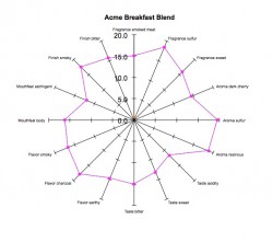
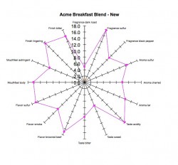
Coffee Analysts’ clients often use spider graphs to map roasted coffee sensory changed over time in order to determine consistency. As an example, a private label retailer has seen sales flatline for its best seller, “Acme Breakfast Blend.” The company suspects a recent change from one of its suppliers has adversely affected taste. If Acme had a spider graph of the original, best-selling “Breakfast Blend,” the company can use it to analyze the poor-performing coffee (see example below). Coffee Analysts can show how (or if) the flavor profile has changed significantly, and then make recommendations on how to improve.
Example – click on image to enlarge, use > and < keys to advance / go back:
Spider Graphs are an important tool for quality control programs and product development projects. The visual representation of various attributes can be an easy to read and understand profile of coffee character.
Coffee Analysts can complete descriptive Analysis projects and chart the results in spider chart format. Also, our standard sensory analysis scores from cupping or tasting can be presented using a spider chart format as well.


